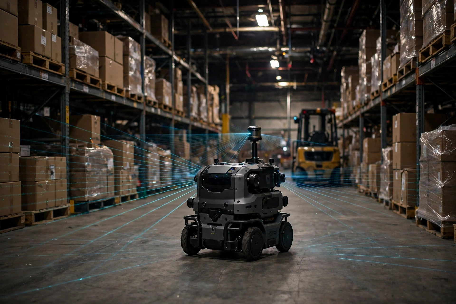
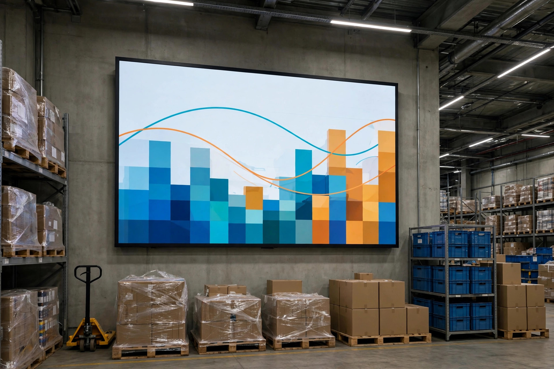
Walk into almost any sizable warehouse today and you will find a large screen near the entrance or office: dark background, flickering numbers, animated curves. Visitors invariably say, "Your digitalization looks impressive." But a question is worth asking: how many people in this building actually make decisions by looking at that screen every day? Based on my site visits and interviews over the past two years, the answer in most warehouses is: almost nobody. The KPI dashboard is becoming the most expensive decoration in the warehousing industry — consuming IT hours, BI budgets, and management expectations while producing mostly the illusion of being data-driven. This article takes the problem apart: which 12 warehouse metrics management should actually watch, where their definitions come from, why dashboards become wallpaper, and where the dashboard itself is heading now that AI has entered the warehouse.
The Phenomenon: Plenty of Screens, Few Users
Consider a concrete scene. In late 2024, I toured a 3PL warehouse in California's Inland Empire — 120,000 square feet, serving a dozen e-commerce brands. A 75-inch screen on the office wall showed real-time outbound volume, picking progress bars, and labor distribution by zone. It looked thoroughly professional. I asked the operations director how often he looked at it. He thought and said: "When clients come to visit." What actually determined overtime that day was a screenshot on the supervisor's phone — the prior day's UPH (units picked per labor hour) ranking by shift. This is not an isolated case: industry research shows warehouse spending on visualization dashboards has grown steadily for five years, yet the share of warehouses where "dashboard data is used in daily operational decisions" has barely moved. Spending is up; usage is flat. That is the true state of the warehouse KPI dashboard: the problem is not a lack of data, but a lack of reasons to look at it.
The Data: 12 Metrics Management Should Watch
Before the "how," the "what." I group management-level warehouse metrics into four categories, three each. The logic: a warehouse's health ultimately shows up in four dimensions — how fast it works (efficiency), how correctly (quality), how much it costs (cost), and whether anyone gets hurt (safety). Miss one, and management sees a distorted picture.
| Category | Metric | Common industry definition | Suggested refresh |
|---|---|---|---|
| Efficiency | On-Time Delivery (OTD) | Share of orders delivered by the customer-requested date; commonly cited target range 95%–98% | Daily |
| Efficiency | Units Per Hour (UPH) | Picked lines per labor hour; definitions vary enormously by product category — use only for internal trending | Per shift |
| Efficiency | Dock-to-Stock Time | Hours from unloading to pick-ready; commonly cited healthy line is within 24 hours | Daily |
| Quality | Inventory Accuracy | Share of locations matching system records in cycle counts; commonly cited range 95%–99% | Weekly |
| Quality | Order Error Rate | Share of orders with mispicks, shorts, or damage; commonly cited in basis points | Daily |
| Quality | Controllable Return Rate | Returns caused by warehouse faults (mispick/damage/delay), excluding no-reason customer returns | Weekly |
| Cost | Cost Per Order Line | Total warehouse operating cost ÷ order lines in the period; for internal trending only | Monthly |
| Cost | Labor Cost Share | Direct labor cost ÷ total operating cost; falls as automation rises | Monthly |
| Cost | Storage Cost Per Unit | Monthly cost per pallet position or per square foot; gauges space efficiency | Monthly |
| Safety | TRIR | OSHA definition: recordable incidents per 200,000 hours (roughly 100 worker-years) | Monthly |
| Safety | Near Misses | Reported "almost happened" incidents; a rising count is initially a good sign | Weekly |
| Safety | Unplanned Equipment Downtime | Hours of unplanned downtime for critical equipment (sorters, forklifts, conveyors) | Daily |
A caveat on the numbers in this table: they are ranges recurring across published industry surveys and third-party reports — "commonly cited definitions," not universal standards. Setting one industry-wide UPH number is not serious — UPH in apparel and in auto parts can differ by an order of magnitude as a matter of course. A metric's real value lies in longitudinal comparison (against yourself) and structural comparison (between shifts, between categories), never in benchmarking against an external number.
A counterintuitive judgment: putting all 12 metrics on one screen is itself the beginning of the wallpaper problem. Dashboards that actually get used daily rarely show more than five core metrics. The correct use is layered: frontline sees 3 operational metrics a day (UPH, errors, daily progress), supervisors see around 8, and only management needs the full panorama. Push all 12 at everyone, and no one looks at any. The first principle of dashboard design is not completeness — it is "who is looking, and what can they do after looking."
The Attribution: Three Reasons Dashboards Become Wallpaper
Why do dashboards with real investment behind them end up as decoration? The attribution comes down to three causes:
First, the wrong metrics — the "flattering" ones. The most common cause. Many dashboards permanently display ever-climbing numbers like "orders shipped today," while error rates, return rates, and cost per order are missing or buried two clicks deep. A 2023 case: a 3PL's dashboard showed OTD above 99% year-round, yet key-account complaints kept rising. Their OTD was measured against the "promised ship date," while contracts specified the "requested delivery date" — a full transportation leg apart. After switching definitions, OTD fell to 92% and took half a year to recover to 96%. The lesson is not data fraud but something more common: if management does not own the definitions, the dashboard shows the version someone wants you to see.
Second, stale data — "real-time" in name, T+1 in fact. Many dashboards are fed by overnight batch jobs, so the "live" numbers are yesterday's. More subtle is definitional lag: if error rates confirm only three days after customer receipt, "today's error rate" is really last week's. The consequence: by the time a number looks wrong, the operation has moved on. The dashboard degrades into hindsight, and nobody watches it.
Third, no owner — a dashboard everyone can see belongs to no one. A screen in a public area that everyone can see is a screen nobody is responsible for. Contrast the UPH ranking screenshot on the supervisor's phone: a clear user (the supervisor), a clear use case (deciding on overtime), a clear action (talking to the bottom-ranked shift). A metric becomes a management tool only when bound to three elements — who looks, when, and what they do after. Otherwise it is interior design.
The Trend: Where KPI Dashboards Go in the AI Era
Stretch the timeline, and the dashboard is undergoing its third transformation. The first was the Excel era: a weekly table reviewed on Mondays. The second was the BI era: data went real-time, but the act of "looking" still depended on people opening the screen. The third, now underway, is the AI era, pointing in three directions:
First, from display to alert-plus-attribution. A traditional dashboard tells you "error rate is up." An AI-driven one goes on to tell you "the increase comes mostly from three new hires in Zone B, concentrated in the 2–4 PM shift" — performing the attribution step as well. According to published technology reports, warehouse analytics tools with automatic root-cause attribution multiplied noticeably through 2024–2025. This is the step that turns a dashboard from a dial into a diagnostic instrument.
Second, from people finding numbers to numbers finding people. When a metric breaches its threshold, the system pushes an alert to the responsible person's phone with a recommended action. The big screen retreats to where it belongs: the war-room backdrop when something goes wrong, not the daily information source.
Third, from numbers to narrative. Generative AI already turns metric piles into management briefings automatically. The significance is not time saved — the process forces companies to standardize definitions and attribution logic first. A report AI cannot write clearly exposes vagueness in the original metric system.
Of course, trend judgments need caveats: all three assume the warehouse's data foundation is already reasonably clean. For operations whose WMS data still lives in Excel, AI dashboards are premature — defining the 12 metrics' definitions and calculation rules, and wiring up their data sources, matters more than any intelligent screen.

An Open Question
Back to the opening question: how should management treat the KPI dashboard? As a medical checkup report, not a painting — its value lies in well-chosen indicators, honest data, and someone prescribing based on it. The 12-metric framework is a starting point, not a destination; every warehouse should prune and adapt it. One open-ended thought: if you switched the dashboard off tomorrow, would operations be affected? If "no," the problem was never the screen — it is the mechanism behind it: who looks, what they look at, and what they do after. Until that is fixed, no screen, however expensive, changes the ending.
By Dr. Chen, Supply Chain Researcher