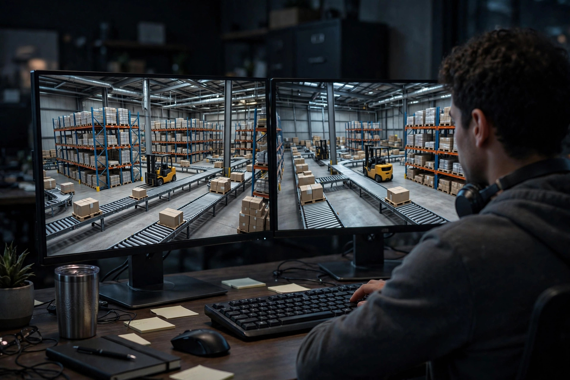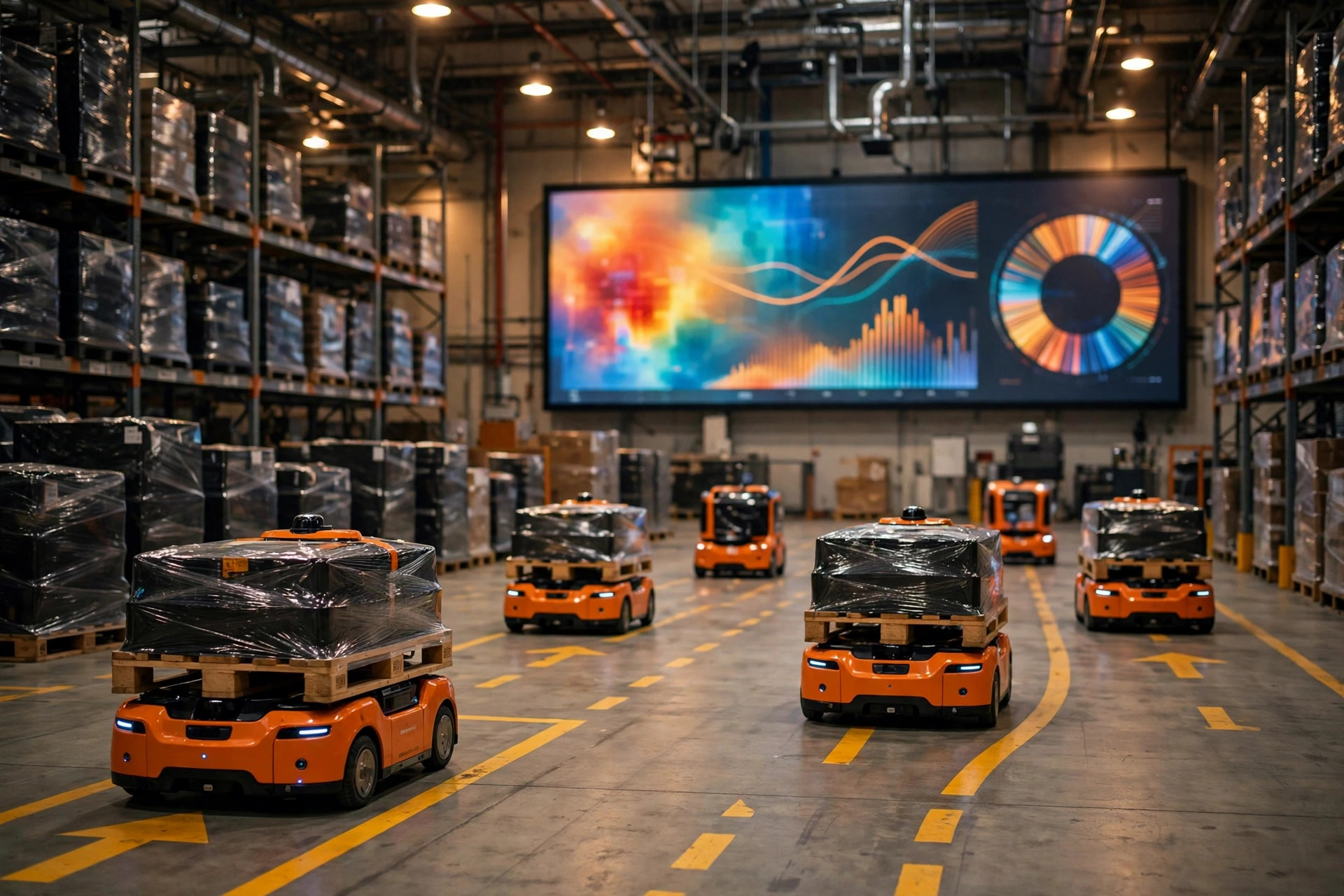
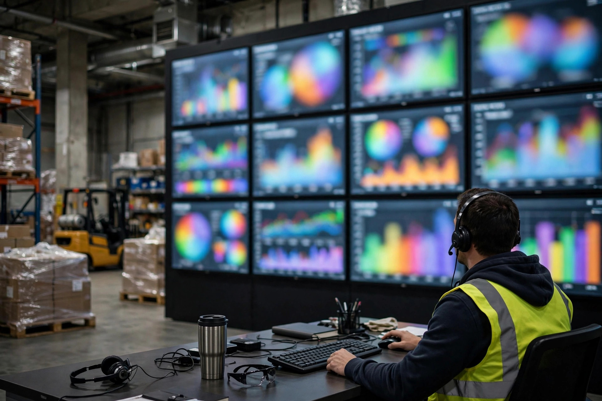
Walk through almost any modern warehouse and you'll find one: a big glowing data dashboard on the wall. Launch day is always a celebration. Three months later, the screen is still on — and nobody looks at it anymore. From the projects I've followed, my rough estimate is that fewer than three in ten warehouse dashboards ever reach the point where someone checks them daily and uses them to make decisions. The rest become either a backdrop for facility tours or a display of numbers nobody trusts. This piece asks one question: how do you actually integrate the three real data sources — WMS, equipment PLCs, and cameras — so that a warehouse data dashboard becomes a tool instead of decoration?
Three Ways Dashboards Die
The first death is neglect. The dashboard shows what the IT department found interesting, not what a shift supervisor needs to answer every morning: backlog by zone, wave progress today, unplanned line downtime. When a dashboard displays "data the system happens to have" rather than "data the floor actually needs," the mismatch is baked in from day one.
The second death is wrong numbers. The dashboard says 5,200 pallets in stock; the WMS says 4,800; a physical count says 4,950. Three numbers, three stories. After a few rounds of this, managers learn the rule: check the WMS for meetings, treat the dashboard as wallpaper. Once numbers lose trust, they never get it back.
The third death is failed integration. The WMS feed made it in, but PLC data is still locked with the equipment vendor, and camera footage only exists in the security office. Three data sources, three silos — and the dashboard can only show the WMS slice, in which case you might as well just open the WMS.
A 3PL warehouse in southern China lived the second death in 2024: the project took half a year and passed acceptance cleanly. Two months later, the operations manager noticed the dashboard's inventory count was off from the WMS by more than 300 pallets. The root cause was depressingly typical: the interface synced from the WMS every 15 minutes, while clerks' manual inventory adjustments traveled through a separate process that never touched the interface. The dashboard displayed inventory that was 15 minutes stale and missing all adjustments. Nobody ordered a rework — people just stopped looking. A slow, chronic death.
Integrating the Three Data Sources: WMS, PLC, and Cameras
A warehouse data dashboard really has three source systems, and each one has a completely different integration path, latency profile, and set of traps:
| Source | Integration path | Latency | Typical traps |
|---|---|---|---|
| WMS (business data) | REST API, or read-only database views / materialized views | Minutes | API field definitions disagree with what the UI shows; heavy queries slow down the production database |
| Equipment PLCs (machine state) | OPC UA gateway, or Modbus-to-OPC-UA gateways for legacy equipment | Milliseconds to seconds | Missing tag documentation — tag meanings live in a senior technician's head; closed protocols |
| Cameras (video + events) | RTSP for live video; AI analysis results via event streams (MQTT/HTTP callbacks) | Video real-time, analytics in seconds | Underpowered inference hardware causes false-alarm floods; recording everything without a privacy review |
The WMS path is the most mature, but one detail gets overlooked constantly: never run dashboard aggregation queries against the production database. A dashboard rollup can easily turn into a full-table scan, and during peak season that can drag WMS response times down by an order of magnitude. The correct pattern is a read replica or materialized views — the dashboard reads only the copy. That convention was paid for in outages.
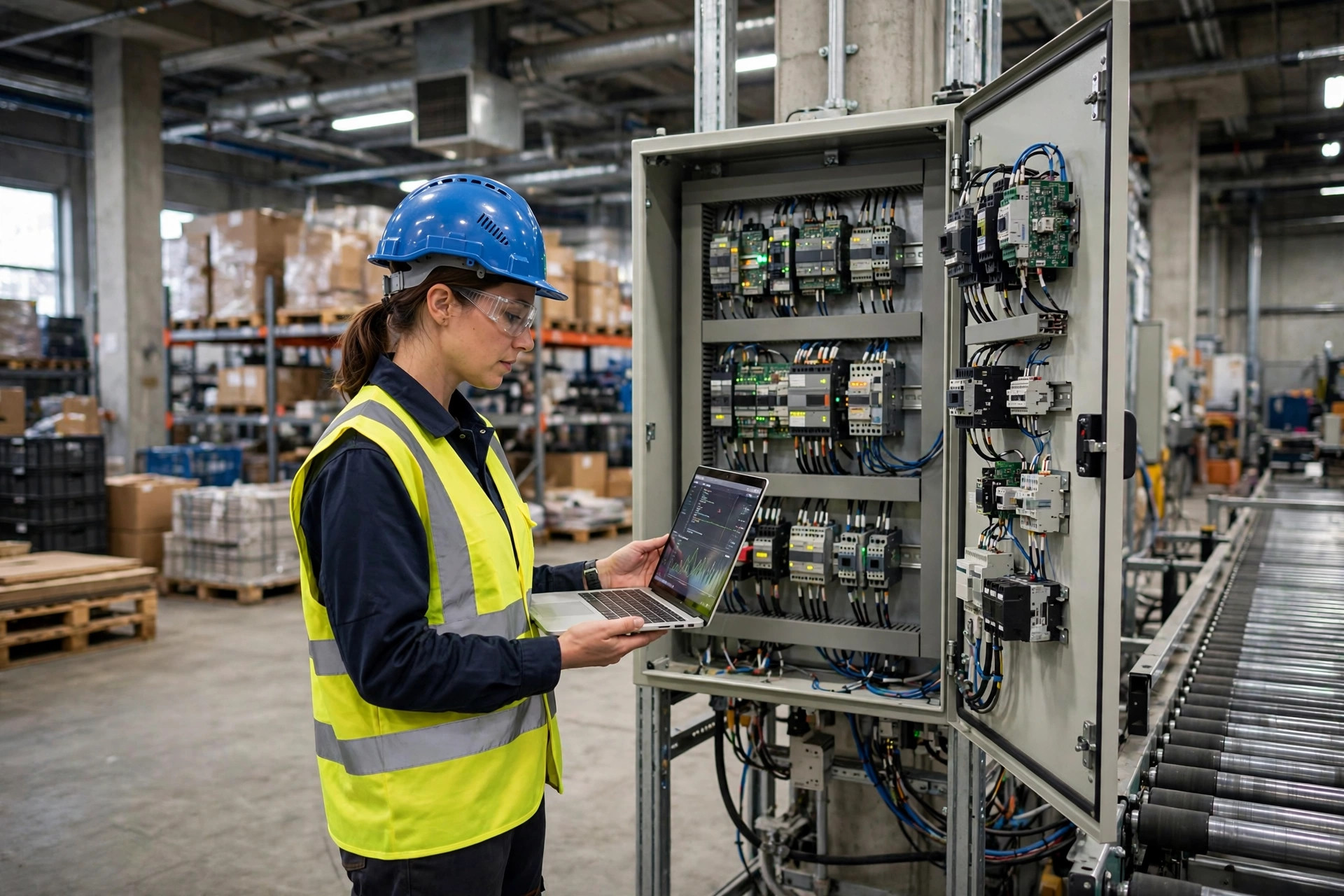
The PLC path is the real hard one. According to several systems integrators I've spoken with, in a mid-size automated warehouse, complete tag documentation is available on the first request less than half the time. For legacy equipment, tag meanings often exist only in a veteran technician's memory — when they retire, the tag list becomes unreadable. OPC UA is the standard answer today; older machines need a Modbus-to-OPC-UA gateway layer. The hardware isn't expensive, but debugging time routinely runs two to three times over estimate — pad the project schedule accordingly.
The camera path has two layers: video and analytics. Video over RTSP is the easy part; the analytics layer (people counting, zone-crossing alerts, empty-pallet detection) is where false positives become the killer. An algorithm that was never tuned on-site will flood the dashboard's alert panel with red the moment seasonal lighting changes or carton stacking patterns shift — and after a few rounds of that, the floor just mutes the alerts.
Why Dashboard Numbers Never Match the WMS: Latency and Definitions
When dashboard figures disagree with the WMS, the root cause is almost always one of two things: the latency chain or definitional drift.
Consider the latency chain. A typical data journey looks like this: PLC generates machine state in milliseconds → edge gateway aggregates in seconds → WMS updates business documents in minutes → dashboard polls the interface every 15 minutes. The longer the chain, the further the dashboard's "now" drifts from the actual now. A 15-minute polling interval seems harmless in design — until peak season moves hundreds of pallets an hour and the dashboard perpetually lags the floor.
Definitional drift is the subtler killer. Take "inventory on hand": the WMS might mean book inventory, the dashboard's SQL might count pallets physically occupying locations, and finance wants received-but-not-yet-shipped goods value. One term, three formulas. In 2023, an auto-parts warehouse in eastern China found its dashboard OEE (overall equipment effectiveness) running nearly 10 percentage points off the equipment team's hand calculation. After a month of arguments, they discovered the dashboard was including planned downtime in the denominator. Misaligned definitions mean more data just produces more arguments.
There is no shortcut: before a dashboard goes live, publish an indicator specification document — every metric gets a definition, a source, a formula, and a refresh cadence, signed off by operations, IT, and the equipment team. It's paperwork. Without it, every number on the screen is floating.
Why IT and OT Can't Meet in the Middle: Three Root Causes
Pull the thread far enough and the failure to integrate WMS, PLC, and camera data turns out to be organizational, not technical.
First, they don't speak the same language. IT talks REST, JSON, and API documentation; OT talks tags, registers, and scan cycles. In joint meetings, IT asks about API authentication while OT answers in 4–20mA signals — two conversations happening in parallel. People fluent in both are vanishingly rare in most companies, yet dashboard projects depend entirely on such translators.
Second, nobody owns data quality. Equipment data belongs to the maintenance team, the WMS belongs to IT, cameras belong to facilities or security. Once the dashboard project kicks off, all three sides say "I'll give you the data, but don't come to me about definitions or quality." The no-man's-land of data quality is where dashboard projects go to die.
Third, nothing is tied to incentives. However polished the dashboard, if it doesn't move any department's KPIs, it's "someone else's project." Put "unplanned downtime hours" into the maintenance team's monthly review, and the tag documentation gets completed within a week. Incentives are the strongest integration force there is.
From Display Boards to Alerts to Auto-Dispatch: Where Warehouse Data Dashboards Are Headed
Warehouse data dashboards fall roughly into three maturity stages:
| Stage | Form | Core value | Prerequisite |
|---|---|---|---|
| Stage 1: Display board | Shows historical and real-time status | Transparency; fewer "walk the floor to ask for numbers" trips | All three sources connected, definitions aligned |
| Stage 2: Early warning | Threshold alerts, exception push notifications | Surface problems when they happen, not the next morning | Latency under a minute; false-alarm rate under control |
| Stage 3: Auto-dispatch | The system issues tasks directly | Less human intervention, 24/7 response | Data trustworthy enough to let machines decide |
Most warehouses are still climbing from stage 1 to stage 2; stage 3 is appearing in highly automated greenfield sites, but broad rollout is years out — and depends on the first two stages' foundations being solid. A dashboard with unaligned definitions jumping straight to auto-dispatch will only dispatch mistakes faster.
In the end, the real test of a dashboard was never "can the three data sources be connected." It's "once they're connected, is anyone willing to own the correctness of the data." Technical designs can be copied; organizational fixes cannot. When a dashboard has someone checking it every morning, driving weekly decisions, and arguing over its numbers every month — that's when it's actually alive. And that, notably, is the one part no technical document can write for you.
By Dr. Chen, Supply Chain Researcher